I've got this one source for tracking the Coronavirus. I've been using it all year.
https://www.youtube.com/watch?v=NMre6IAAAiU
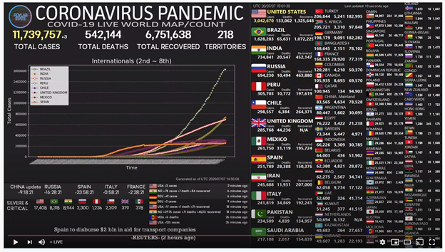
While you're on that site, graphics scroll past. I pick out the one that shows total infections for the U.S. It can be a little tedious to catch, but if I collect it every time I visit, it gives me a consistent perspective. This site used to show the highest eight countries on the first chart, then all the remaining most-infected countries on the following charts. After a while, the U.S. headed so far off on its own scale, we were losing the detail for the other countries, so they devoted the entire first chart to the U.S., then showed all the other countries on different charts with different scales. The ones for all the other countries look like this:
2 – 8.

Brazil is the star of the show on this page.
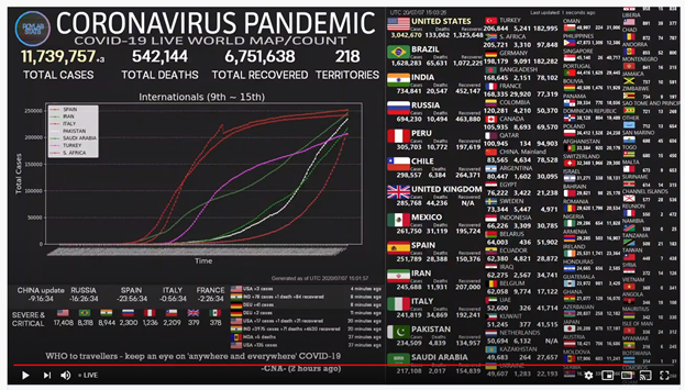
9 – 15.

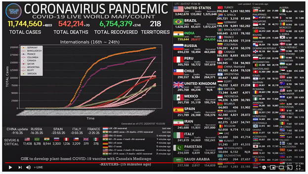
16 – 24.

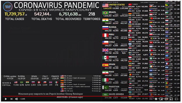
These charts show the 24 countries with the highest number of Coronavirus cases, except almost every time I look now, the chart for the U.S. is blank, like this.

At first, I thought I might have just caught the site loading data so it showed nothing, but that's not it; it happens way too often for the U.S. screen, and never happens to any other pages. I can still find the U.S. chart to copy once in a while, but it is getting much harder to catch. I'm not normally one to wander down the conspiracy path, but this is quite the coincidence; the one chart we can't see is the one that best illustrates our condition. It seems almost as if someone doesn't want us seeing that data…
No comments:
Post a Comment