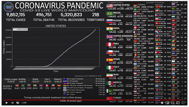
I've been tracking this same graph for months.
If the line for total cases stays straight, then we've got the same number of new cases every day. For every little bit the line tips to the right, the virus is that much closer to being under control. However, if the line starts to curve up to the left…
Here is a link to an amazing animation from the New York Times about the coronavirus spread.
Once the page loads, you can scroll down through the text to control the speed the story unfolds.
This thing is not done with us yet. Please everybody, stay safe.

No comments:
Post a Comment